What is the footprint?
Footprint charts allow you to see the interaction between buyers and sellers at a granular level, analyzing the transactions themselves rather than the trends they form.
The footprint graphic was created in 2003 by a company that has now disappeared. All major trading platforms for professional traders have adopted it under alternative names.
Here are some of them: cluster charts, bid/ask profile and numbered bar.
But what exactly is a footprint graph?
A footprint chart is a multi-dimensional type of candlestick chart that shows traders the volumes traded at each price level in that candlestick.
It’s a bit like a candlestick with annotations that indicate how the trades have performed in that bar.
How to read a footprint?
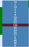
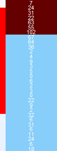
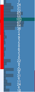
Compare the image below, on the left is a traditional candlestick chart, on the right is a footprint chart.
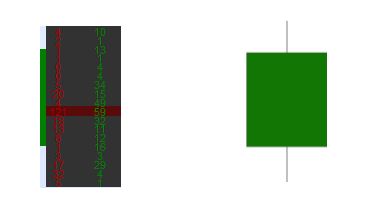
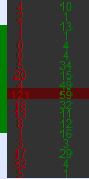
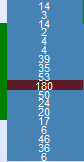
On the left side of the footprint chartare the sellers, and thus the volume sold by them on each price level.
On the right-hand side of the footprint graph, we find the buyers and therefore the volume purchased by them on each price level.
For example, the 121 x 59 cluster, at this price level, there were 121 lots for sale and 59 lots purchased.
Footprint charts allow investors to examine executed orders in a candlestick chart and analyze the interaction between buyers and sellers.
Types of footprint
The three most common types of footprint charts are “bid/ask”, “volume” and “delta”.
Footprint Bid/Ask:
This is the most common type of footprint graph. The number of contracts traded on the bid and ask prices for a given period is displayed.
On the left the sellers, on the right the buyers
Footprint volume:
The Volume Footprint shows the total number of contracts traded at each price, regardless of whether the transaction was a bid or a ask. This can be useful to show price levels where there is interest from both buyers and sellers.
Footprint delta:
The delta represents the difference between the number of lots sold and purchased for a particular price.
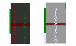
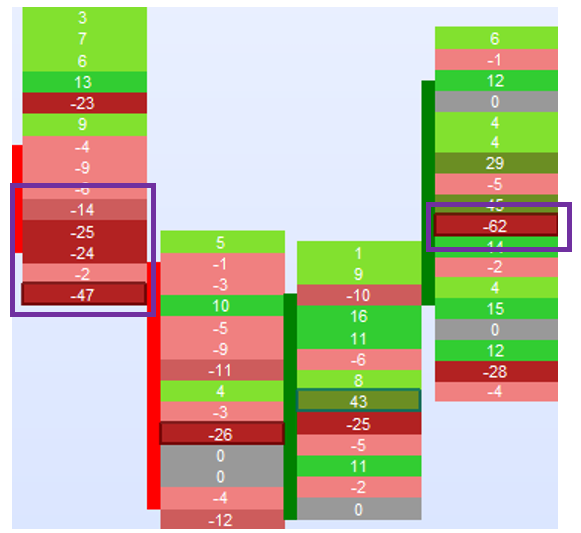
For example:
The delta of the price level with the most volume is: 59 – 121 = -62
Knowing the volume differences initiated by buyers and sellers at different price levels can help a trader determine which party is more aggressive. This information also allows us to confirm or not the suspicion of a change in trend.
In the “Horus – Footprint“, it is also possible to display only the buyers or only the sellers. This allows you to focus your analysis on a single branch depending on the direction of the trade you are looking for.
How to analyze?
When we look at Footprint charts, we look for clues that tell us that a particular price level is important because the transactions tell us so.
This takes many forms, including:
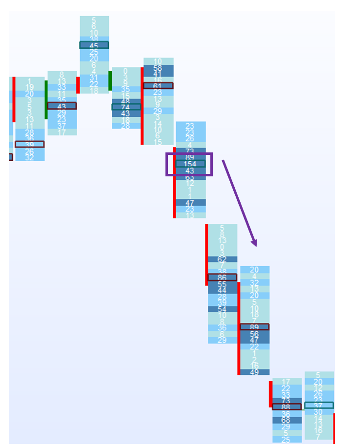
Inbalance / stack Inbalance – Unbalanced purchase or sale amounts
In the example above an imbalance zone on the left and an imbalance at a price level
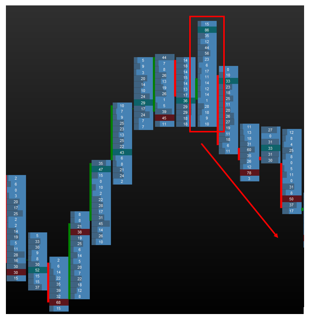
Order Block – Large volumes resulting in acceleration
High volume node – Areas where large amounts of volume accumulate
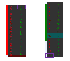
Unfinished/Finished auction (business) – an auction is said to be finished when there are 0 buyers at the top of a candlestick in an uptrend, or 0 sellers at the bottom in a downtrend. This allows us to recognize a potential loss of momentum in the trend
On the other hand, we say that an auction is not finished when there are still buyers at the top of a candlestick, and sellers at the bottom of a candlestick. They act like magnets, attracting the price to complete the auction, and therefore can be used as a target for a trade.
These analyses allow us to have a finer vision of the intentions of the market players, which will lead us to certain strategies as we will see in the next part
To facilitate this analysis there are several types of displays in “Horus – Footprint“:
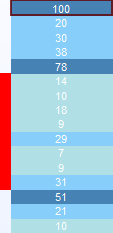
VPOC only – highlights the price level with the most volume, which can act as support/resistance depending on the context.
Median – Splits the candlestick in 2 at the median, this makes it very easy to identify p or b profiles
Volume Profile – Displays a profile on the different price levels, which allows a finer visualization of the distribution of volumes, allowing in particular to refine the profiles in p or in b.
Custom Colorization – Colorizes the price levels according to user-defined values, thus highlighting certain levels.
Footprint Strategies
The key to any analysis is to use the context, or look at the big picture, to frame your trading. Therefore, all of the strategies discussed below must be put into a higher level of context and analysis.
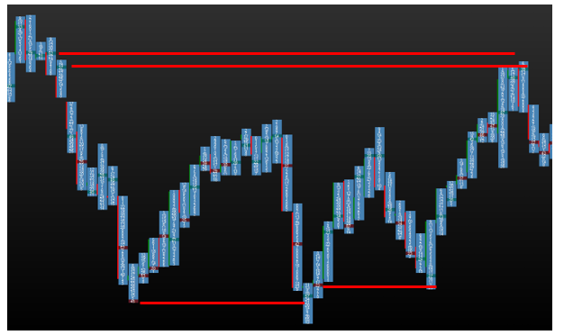
Naked VPOC – Support/resistance
A simple strategy is to identify the vpoc of significant candlesticks, i.e. candlesticks forming a higher/lower/break, which have not been tested (“naked”). When the price returns to test the identified vpoc, there is a high probability that the price will make a pullback.
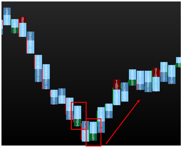
Reversal
For this strategy you should use the median or profile volume visualization.
This consists of spotting candlesticks with a volume profile in p or b, which announce a potential reversal:
- Profile in p, most of the volumes are located at the top of the candle, announcing a possible downward reversal
Example with the profile volume display
- Profile in b, most of the volumes are located at the bottom of the candle, announcing a possible reversal to the upside
Example with the display of the median
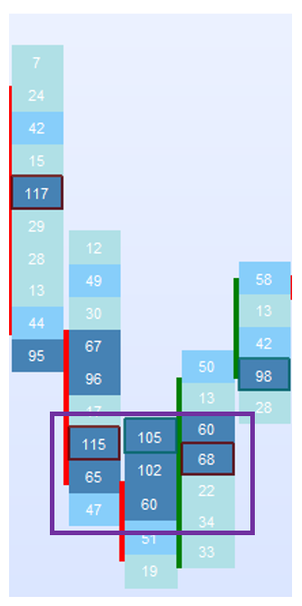
Stacked Imbalance / Highvolume node
Once identified, these zones act, depending on the type, as supply/demand zones (support/resistance).
This allows for potential rebound areas
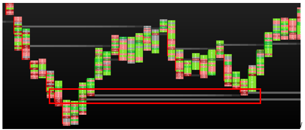
In the example above you can see the reaction on the imbalance area
Of course you can combine some of these strategies to optimize your positions.
get the FootPrint indicators in your platform now:
Horus – FootPrint + FootPrint Extension – 40% off – Limited offer
Find other products of the seller Horus in his store: https://market.prorealcode.com/store/horus/